What's Inside / The customers / S4 Customer Value & Segmentation
Cohort analysis and customer value, read in margin
Revenue-based cohort analysis tells you which group of customers spent the most. It cannot tell you which group left you the most, and those are often different people. Section S4, Customer Value & Segmentation, values every customer over their whole life in margin terms, then shows where they sit today and where they are heading.
Customer Value & Segmentation places every customer in a lifecycle state, shows who moved between states this period, re-scores RFM on CM1 instead of revenue, and ranks what drives repeat purchase. Build cohorts and segments yourself or start from the recommended ones, and any number drills to the actual customer list.
5.0 on Google · 100+ businesses · $153M revenue influenced
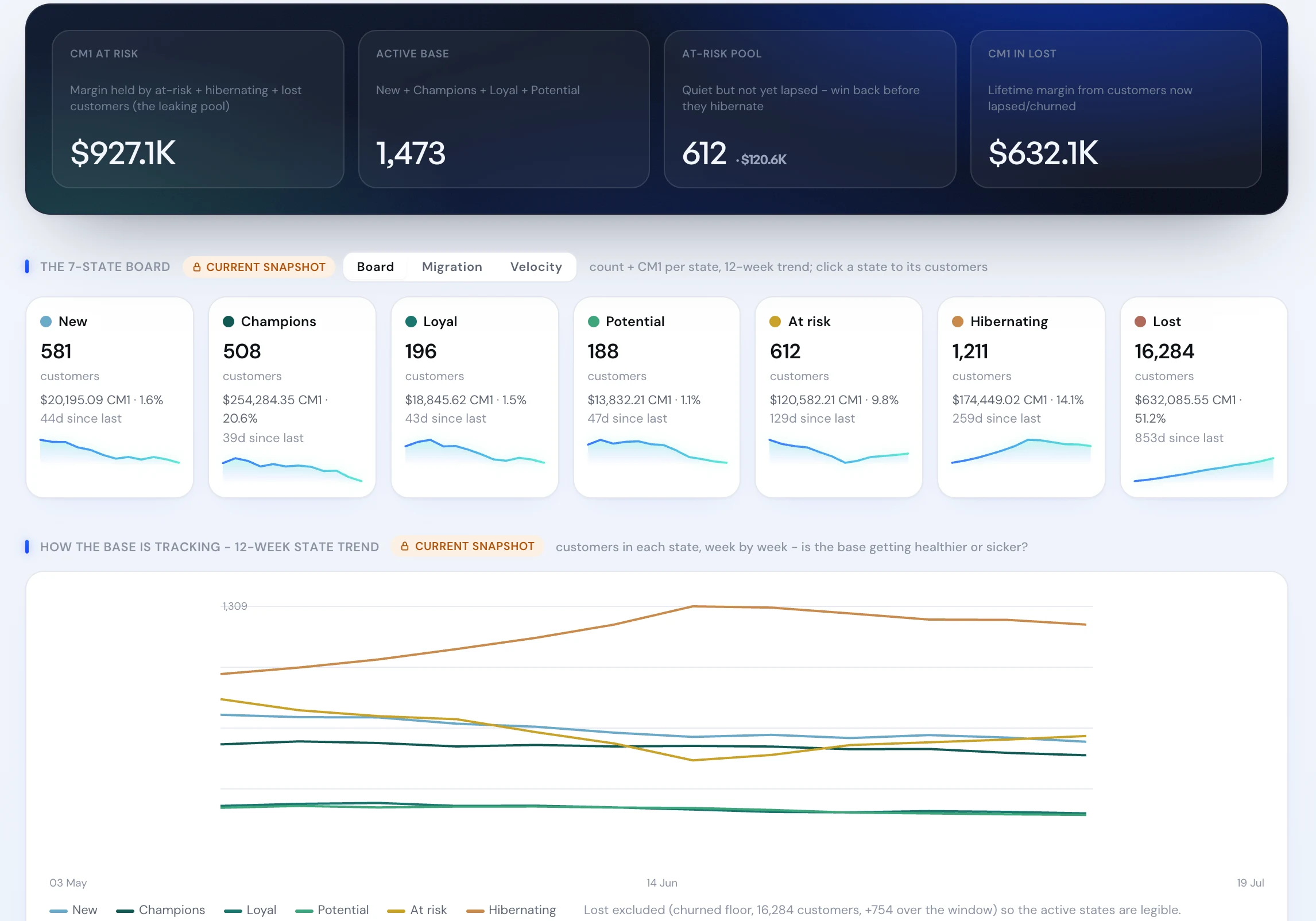
Real product screen, shown on sample data.
Seven states, and the margin sitting in each.
The 7-State Lifecycle Board places every customer in one state: New, Champions, Loyal, Potential, At risk, Hibernating or Lost. Each state shows its customer count, the CM1 it holds, days since last order and a 12-week trend. Above it, the headline reads the CM1 at risk, the active base, the at-risk pool worth winning back and the margin already lost.
Click a state for its customers, and open any one for their full profile.
“They're experts in their field and genuinely seem to care about us winning… they achieve all the results we could hope for where it matters.”












Three questions a revenue cohort chart cannot answer.
Which customers look like VIPs but lose us money? The RFM cube keeps recency and frequency the same and changes only the value axis, from revenue to CM1. Anyone who drops a segment when you flip it was being funded by discounts or low-margin baskets. Financial Buckets and the Discount-Dependency overlay separate them from the profitable loyalists. More on VIPs who lose money.
Who is about to stop buying, and what are they worth if we save them? State-to-State Migration shows who is drifting toward churn this period, and survival curves with BTYD-predicted CLV price what each drifting customer is still likely to be worth. The win-back is sized in dollars before it is sent. More on customers about to churn.
Which first product turns a one-time buyer into a repeat customer? The entry-category repeat scorecard and the first-order value to repeat curve show which first purchases create repeaters, and the Entry Product x Channel matrix shows where those first orders come from. More on the first product that drives repeat.
Two cohorts, ranked by revenue and then by margin.
Two acquisition cohorts, six months on. January was acquired with a sitewide sale. February was acquired at full price on a smaller budget.
On a revenue cohort chart, January wins by A$38,000. On margin, February wins by A$5,400, and each February customer is worth A$18 more (A$63 against A$45). If both cohorts cost the same to acquire, the sale bought more customers and less profit.
That is the point of running cohort analysis on margin LTV rather than revenue: it changes which acquisition month you try to repeat. Test your own cohorts in the margin LTV calculator.
Who moved, where to, and how much margin went with them.
Migration is a from-to grid: rows are where a customer started the window, columns are where they are now. Value-losing moves are shaded red, reactivations teal. Above it sit the customers who lapsed into Lost, those reactivated, and the net movement per state.
The biggest leak is named in one line, with its customer count and CM1, and clicking it gives you the list. That list is the win-back audience.
- Biggest leakThe single state-to-state move carrying the most margin, drillable to its customers.
- Net movement per stateWhether each state grew or shrank over the window.
- Survival curves & BTYD CLVWhat a drifting customer is still likely to be worth, so the save is sized in dollars.
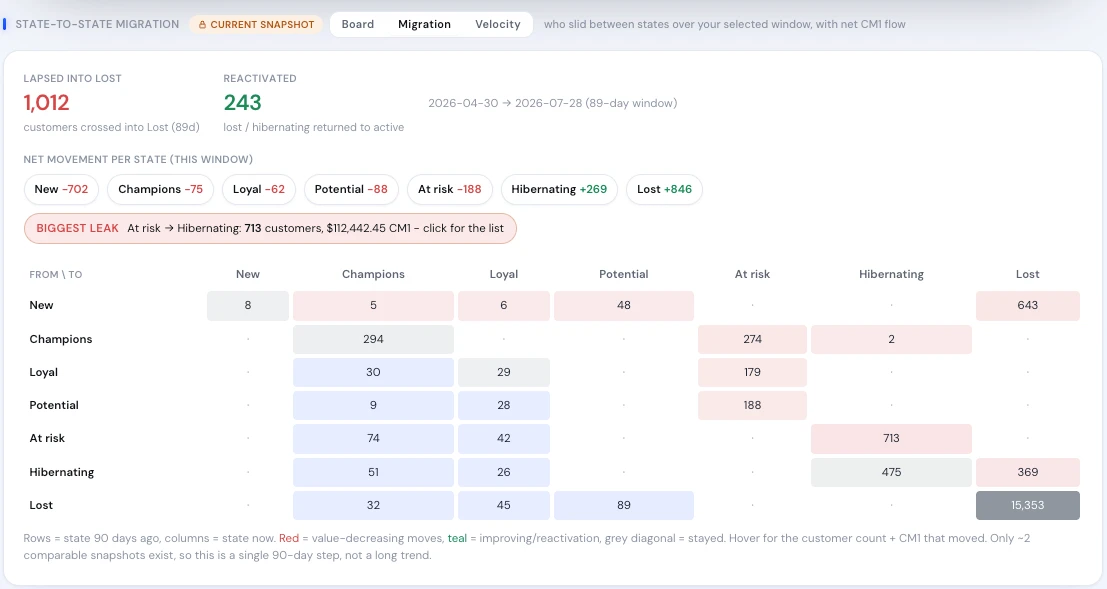
Real product screen, shown on sample data.
One customer base, four reasons to open it.
The CMO or retention lead works the migration grid and the at-risk pool, and hands the drilled list to the Activation Bridge to send.
The founder reads the RFM cube flipped to CM1, because knowing the real best customers changes pricing and product decisions, not just email.
The CFO reads CM1 at risk and CM1 in Lost as balance-sheet questions: how much future margin depends on customers who are quietly leaving.
Ops and merchandising read the entry-category scorecard, because the product that brings someone back belongs in stock and at the front of the range.
From a cohort chart to a customer list.
Cohorts are ranked on revenue, so discount-led months look best.
Cohorts and segments are valued on CM1 over the customer's whole life.
Churn is noticed when a segment is already gone.
Migration shows who is drifting this period, and the biggest leak is named.
VIP lists include big spenders who only buy on sale.
The RFM cube flips to margin, and the Discount-Dependency overlay separates them.
Every insight ends with "we should build a segment for that".
Any number drills to the customer list behind it.