What's Inside / The money / S1 Executive
The ecommerce KPI dashboard that starts with what you kept
Most ecommerce KPI dashboards open on revenue, sessions and ROAS, then leave you to work out whether any of it made money. Section S1, Executive, opens on contribution margin and tells you what moved it, line by line, with a data health page behind every figure.
Executive is one read of the business in CM1 terms: the Portfolio Headline, a What Changed decomposition of the period's move, and the biggest problems ranked for your seat. Every number can be checked against data health and connector status before you act on it.
5.0 on Google · 100+ businesses · $153M revenue influenced
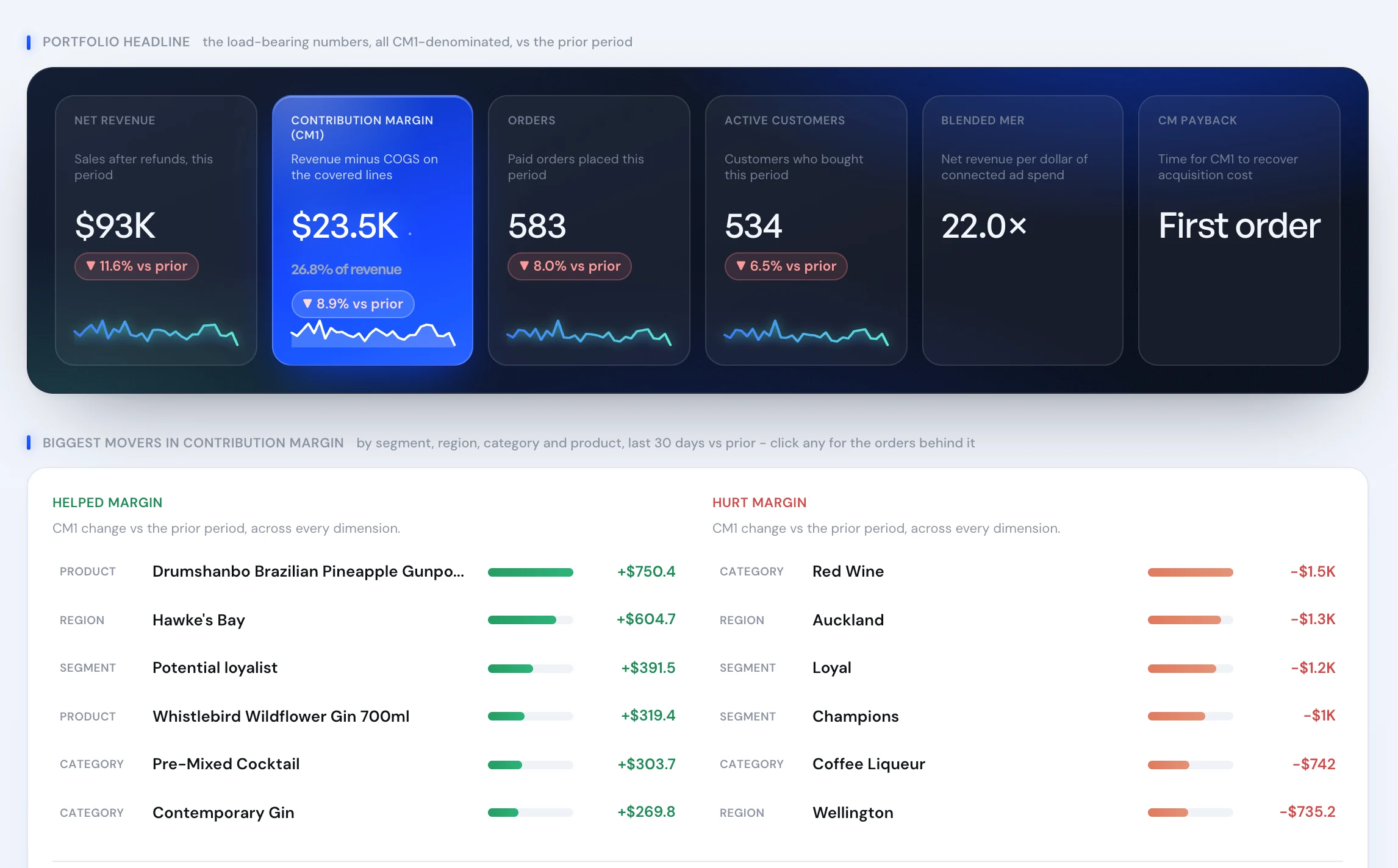
Real product screen, shown on sample data.
Six load-bearing numbers, then the reasons they moved.
The Portfolio Headline puts net revenue, contribution margin, orders, active customers, blended MER and CM payback side by side, each against the prior period. Contribution margin sits in the middle on purpose: it is the number the others explain.
Underneath, What Changed splits the period's CM1 move into the things that helped margin and the things that hurt it, across product, category, region and customer segment. Click any line and you see the orders behind it.
“I couldn't be more impressed with the Blufire team and the improvements they have made… working on the account and maximising results daily.”
 A$942kin incremental revenue once the double-counted attribution was fixedRead the case study →










Revenue up 12%, margin down A$1,500. Decomposed.
Last period: A$100,000 in net revenue and A$30,000 in CM1, a 30% CM1 rate. This period revenue reaches A$112,000. Here is how What Changed reads the move.
The revenue tile says the business grew 12%. The margin says it kept A$1,500 less, and the CM1 rate fell from 30% to about 25.4% (A$28,500 ÷ A$112,000). Every dollar of that fall has an owner: discounting, mix and refunds.
That is the difference between a dashboard and a decision. A founder reading only revenue would scale the promo. A founder reading the decomposition would ask whether the sale range earned its discount. Run the same arithmetic on your own P&L with the Shopify P&L template.
Why a revenue-first dashboard keeps you guessing.
A revenue tile going up is the most common false comfort in ecommerce. It rises when you discount harder, when the mix shifts to cheaper products, and when refunds have not landed yet. That is how a brand ends up asking why revenue is up and there is no more money in the account.
Executive is built to answer four questions in order. What did we keep this period? What changed it? Which of those changes matters to my job? Can I trust the number? The first two are the Portfolio Headline and What Changed. The third is the role lens. The fourth is Data Health, which is why no figure on the page stands on its own.
It is a read, not the whole analysis. When a mover needs more than a glance, it hands off: a product margin leak goes to Unit Economics, a code giving margin away goes to Discounting.
One page, read differently from each seat.
The founder opens it first thing on a Monday. The question is simple: did we keep more than last period, and if not, why? The helped and hurt lists answer that before the coffee is finished.
The CFO lives in the CFO lens and its scorecard over time, because a single period can lie and a trend rarely does. Data Health matters most here: a margin figure is only as good as the COGS and connector coverage under it.
The CMO or growth lead reads blended MER and CM payback next to contribution margin, so spend is judged on what it returned in margin rather than on platform ROAS. The problems ranked for that seat point to the channel or audience to look at next.
Ops reads the movers by product and category. A line in the hurt list is often a stock, pricing or returns problem before it is a marketing one.
From a wall of KPIs to one read.
Revenue is the headline and margin is a spreadsheet someone builds at month end.
Contribution margin is the headline tile, compared with the prior period every time you open it.
A bad month gets explained in a meeting, from memory.
What Changed splits the margin move into helped and hurt, with the orders behind each line.
Everyone reads the same dashboard and argues about what matters.
Each role lens ranks the biggest problems for that seat.
Nobody knows if a number is wrong until it is quoted to the board.
Data Health and connector status sit behind every figure.